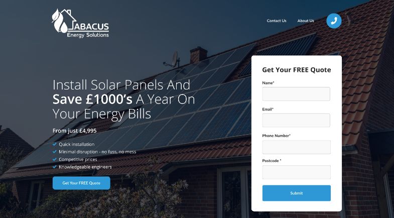
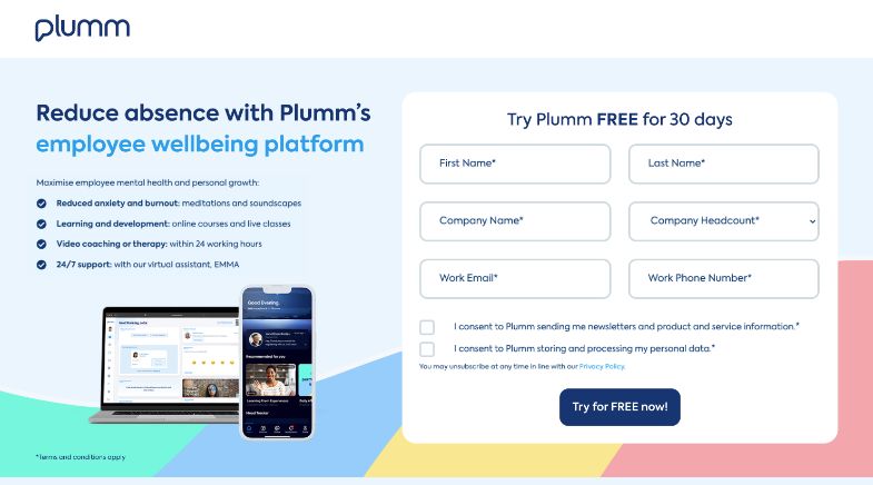
You might have never heard of the term ‘Landing Page’ before but we can guarantee you’ve come across plenty of them.
Landing pages are a staple of the online world, in fact, you’ll not be able to browse the internet for long without coming across one.
As a business, landing pages can be an essential part of your overall marketing strategy and in this post, we’ll discuss what a landing page is and how a fully optimised one is designed.

What is a Landing Page?
To understand how we can optimise a landing page for conversions, first we need to understand what a landing page is, how it differs from a home page and what its main purpose is.
A landing page is a web page that has been specifically designed to convert visitors into customers or leads.
It’s often the page visitors land on after clicking a PPC ad or from an email marketing campaign.
So, unlike a home page which typically has different goals (providing information and encouraging exploration around the rest of your website), a landing page has a clear focus or goal and guides the visitor to your specific CTA (Call-to-Action), product, service or offer, eliminating any distractions.
How to Design a Conversion Optimised Landing Page
So now we understand what a landing page is, we can move on to the design process.
But before we dive right in, it’s important to first establish your goals and how these will be measured.
Your goals may be purchases of a product, sign-ups to a mailing list, downloads or completing a lead form.
You should decide what you want visitors to do on your landing page and then design with these objectives in mind.
This helps to create the best landing page possible, optimised for conversions.
Initial Impressions Count
We’re all human so first impressions count – unless you’re an AI sentient being of course, but then you’re not human so it still goes.
Whether it’s a landing page or meeting someone for the first time we all make assumptions and judgements based on the first few seconds of interaction.
Those first few seconds are all it takes to grab your customer’s attention
Otherwise they may bounce off the page and never return.
This means the top section of your landing page, known as ‘above the fold’, is the most critical part of your landing page design.
It needs to capture your customer’s attention and clearly show the purpose of the page, as well as any key information and be free from distraction.
Remove Navigation
To allow the focus to be all about your product or offer and to clear any distractions, it’s a good idea to remove navigation from the page.
That is, the menu bar at the top that can take a visitor off to other pages on your site needs to be removed. This is because we want our visitors to stay on our purpose-built page and not go wandering off on their own.
Removing the navigation has been shown to increase conversions significantly when A/B tested with pages that still have the navigation displayed.
Attention-Grabbing Headline
The next step is crafting a headline and sub-heading that will grab the visitor’s attention.
This is the first thing they will read so it should be clear, concise and communicate the value your page has to offer.
Doing so will entice them to explore further and scroll down the page.
Just don’t use clickbait headlines.
Nobody likes to be clickbaited.
Easy-to-Read Fonts
Not only does the messaging need to be clear, but it needs to be visually clear too.
Use an easy-to-read font and let it breathe, don’t cram it in or distract too much with imagery.
Be especially careful if you are placing text over an image, ask yourself ‘Is this easily readable?’.
Don’t forget that the image can move, so your text needs to be legible at all times on all screens and on all devices.
Some Sans Serif Google fonts we recommend:
But don’t forget to keep your typography on brand and refer back to brand guidelines.
While easy-to-read fonts are important, it is also best practice to use appropriate font sizing and aim for accessibility for visually impaired users.
Using imagery and colour
It’s important to support your attention-grabbing headline with some high-quality visuals.
Images and videos really help to break up text and make your landing page more visually appealing.
They can also help to evoke an emotion or feeling your potential customers may get from your product.
For example, if you’re selling engagement rings, you would use imagery that conveys love, joy and happiness.
After all, these are the emotions you would expect your customers to be feeling if they were to purchase this product.
Colour can be used in a similar way and alongside images to make your page more visually appealing and to convey emotion.
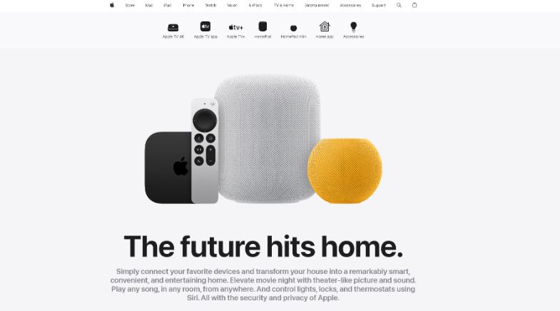
Apple is a great example of using contrasting colours and images.
Their pages tend to have a stark background and clear messaging alongside high-quality visuals and repetition.
There is plenty of room to breathe, which helps to keep the visitor focussed.

Those guys over at Apple sure know how to design!
The All Important CTAs
Your landing page should use actionable language for CTAs.
They should tell the visitor what they should do next, and guide them by using clear and concise messaging or even directional cues with visual elements.
Some examples of actionable CTA language are:
- Add to basket.
- Buy now.
- Shop now.
- Learn more.
- Download.
- Subscribe.
- Sign up.
- See more.
They all tell the visitor what to do next, there is no uncertainty.
As well as being short and simple and straight to the point, your CTAs need to be super easy to find.
To do this you should use contrasting colours to make your CTAs stand out on the page.
At the end of the day your CTA is the next step to getting a conversion so make it bold…within reason of course!
Putting The Optimised Page Together
Now we have our building blocks and we understand the importance of the different elements on our landing page, we need to structure the page in an effective way by creating a journey through the page.
The journey will look something along the lines of this:
- We grab the customer’s attention at the top and clearly explain what the page is about and what its value is to the visitor.
- Then we need an actionable element so this may be a product or a lead form, this needs to be high up the page and followed with why they need this product or service.
- This may be in the form of relevant information, the benefits it will provide or proof that your product or service is high-quality. Also, show customer testimonials as they can help reduce any concerns they may have about taking the next step and converting into a loyal customer.
- If we haven’t converted them in the top half of the page, we get another shot at it with the second half.
Responsiveness and Testing
Once you have your landing page looking enticing and utterly fabulous, don’t forget about responsiveness.
Your page may look amazing on your desktop, but make sure it looks just as good on all browsers, devices and screens.
Depending on your target audience, you may get much more mobile traffic compared to desktop.
So it’s vital that your landing page performs on a small screen.
Mobile screens have even less space to grab the attention within the first few seconds, so make sure to structure your page so that the most important, relevant information and imagery are at the top.
As much as we may love our final design, testing is where we see what really works.
There is no escaping the undeniable truth of the data.
Make sure to test, analyse and tweak your landing pages where necessary to get the best results and highest conversion rates.
It’s always best to change one thing at a time and test again to see what impact it’s had, whether positive or negative.
Conducting A/B testing is also a really useful tool in finding out what layout, images or copy performs the best with your visitors and what generates the best results for your business.
Creating conversion-optimised pages is not a one-time process.
You can use feedback data and pain points to make the process easier for customers, reducing the friction along the purchase journey.

Landing Pages that Convert
We hope you enjoyed this guide on how to create a conversion optimised landing page.
As you can see, there is a lot of thought that goes into creating and designing landing pages.
There’s a method to the madness as they say.
Here at Blaze Media, we have created landing pages for many types of businesses across a variety of industries.
We’re experienced in delivering landing pages that have high conversion rates and get your special offer or message across to your target audience.
If you would like to know more about how we can help your business with high-converting landing pages then please reach out to us today.


