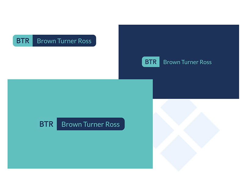
The first step in the project was to design a new look for the brand. The old logo was styled in red and hadn’t been updated for many years so the firm decided they wanted to bring it more up to date.
Next up came the page layout and copy writing which was a complex task to ensure every aspect of the business was represented and the correct information was available and easy to understand for the lay person.
With over 50 pages of content to write, a thorough research period was needed to ensure every minute detail was correct and all compliance was strictly adhered to.
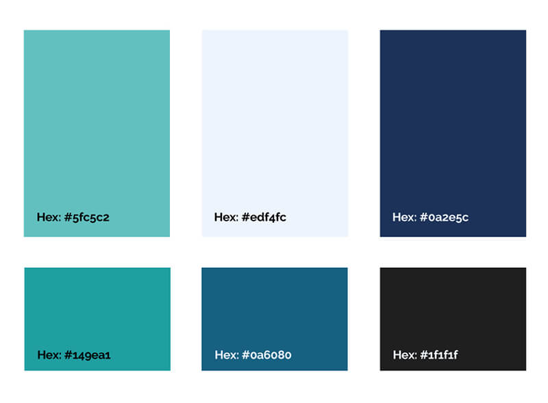
Colour Scheme
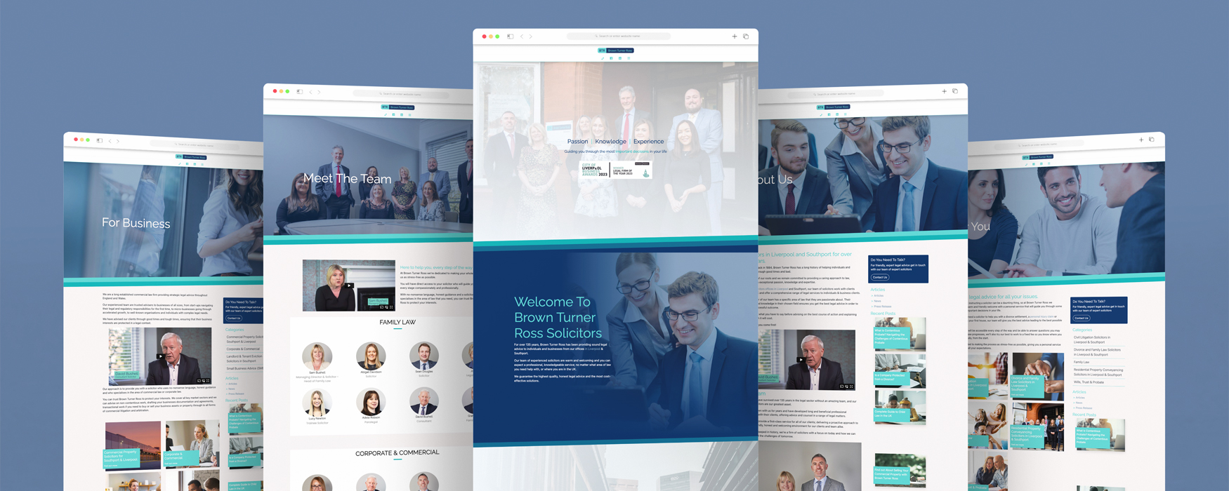
Once the layout was agreed upon, the build came next with our developers and designers crafting a site that is fast, user friendly and easy to navigate site.
Activity and engagement on their accounts is also up and a rolling 90-day review shows a staggering increase up to 16th October 2020.
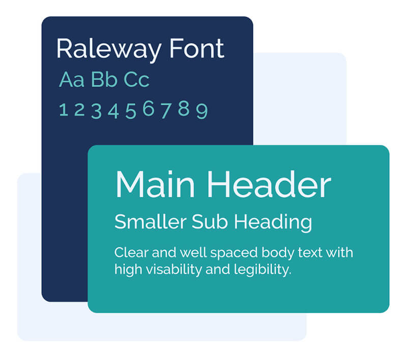
The Typography
After compiling a portfolio of various alternatives, they decided on a stunning dark blue and teal colour scheme, using the Raleway font to complement a much more modern style.
After compiling a portfolio of various alternatives, they decided on a stunning dark blue and teal colour scheme, using the Raleway font to complement a much more modern style.


