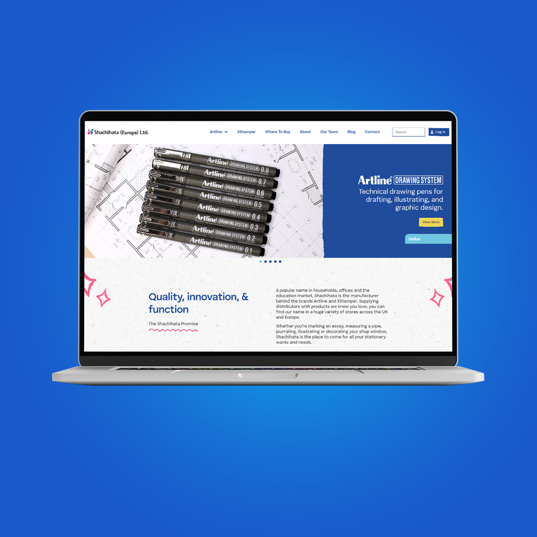
We took all of their needs into account, and our development team immediately began creating a modern, user-friendly website.
The first stage was to create a new home page design that would be the foundation of the new design.
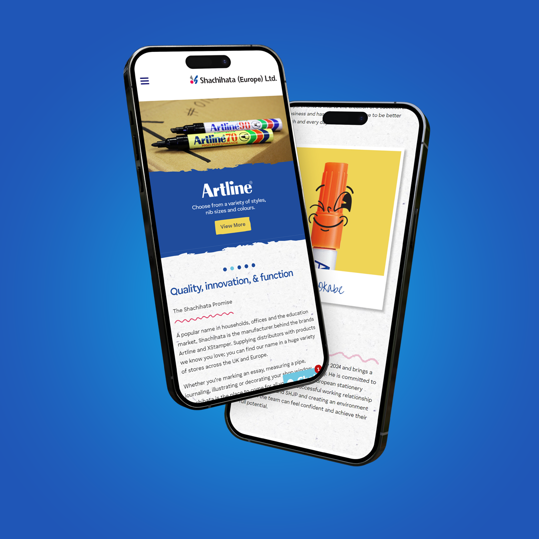
The team at Shachihata was up for a fun site so the design team fully embraced the brief and added loads of fun doodles across the design along with the use of plenty of colour and movement.
Once signed off, we cracked on with the rest of the site, using different doodles to reflect different categories of markers and stampers.
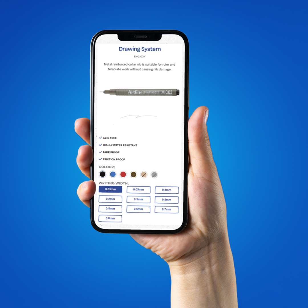
We ensured that all of their products were displayed clearly and made it a priority to show which pens come in which colours and nib sizes.
Clarity was essential during our development process, and so was adding personality to their site. After all, their products were used for creative purposes.
One of our favourite pages is the Meet the Team page, with a few team members missing headshots, our designers got seriously creative!


