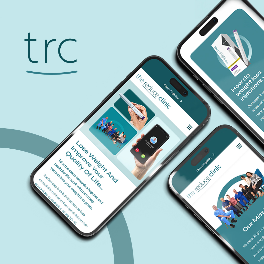
Our Design and Development Team got straight to work and created a simple, sleek logo that embodied the brand’s professionalism without leaning too far into a corporate look. Along with the logo, our team created brand guidelines to equip The Reduce Clinic for any future company expansion.
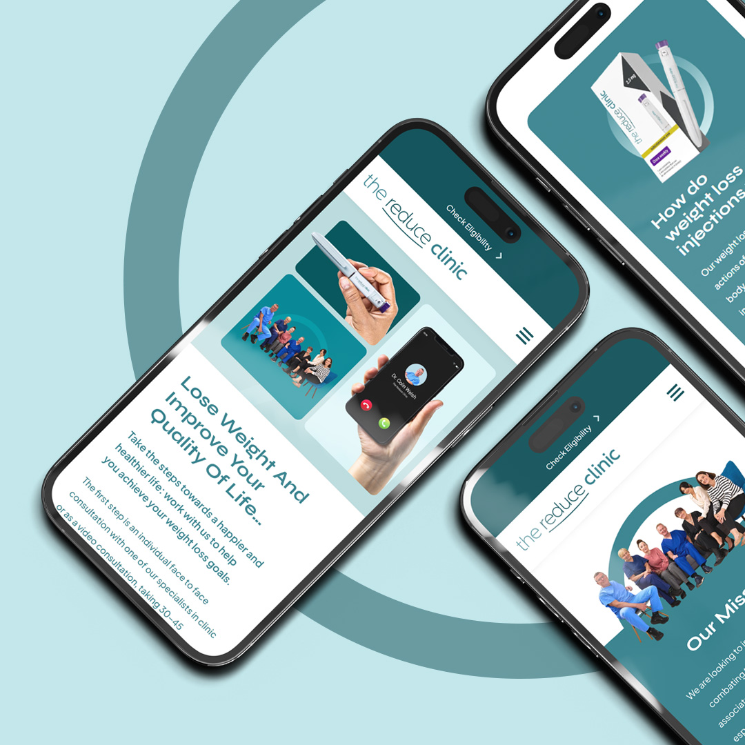
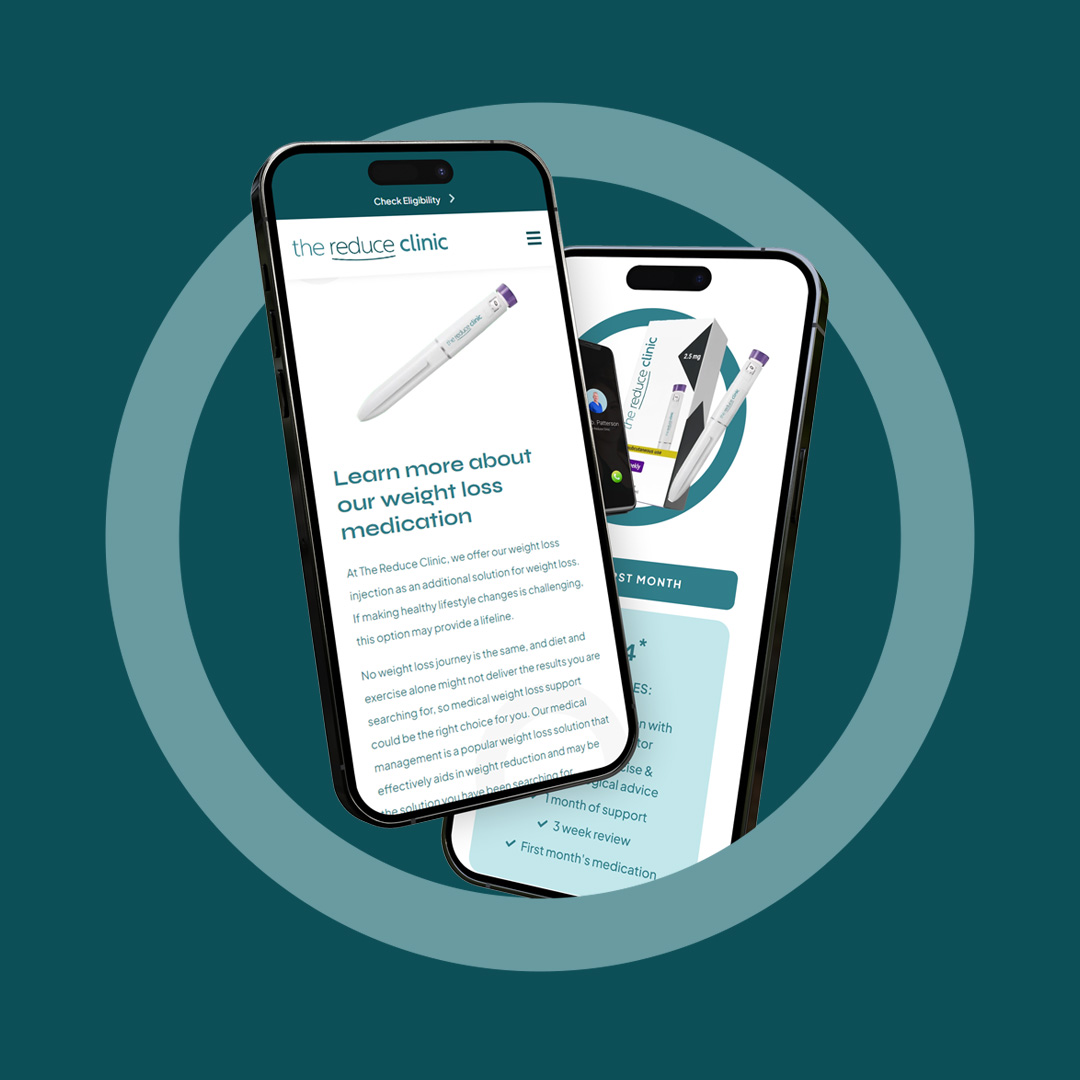
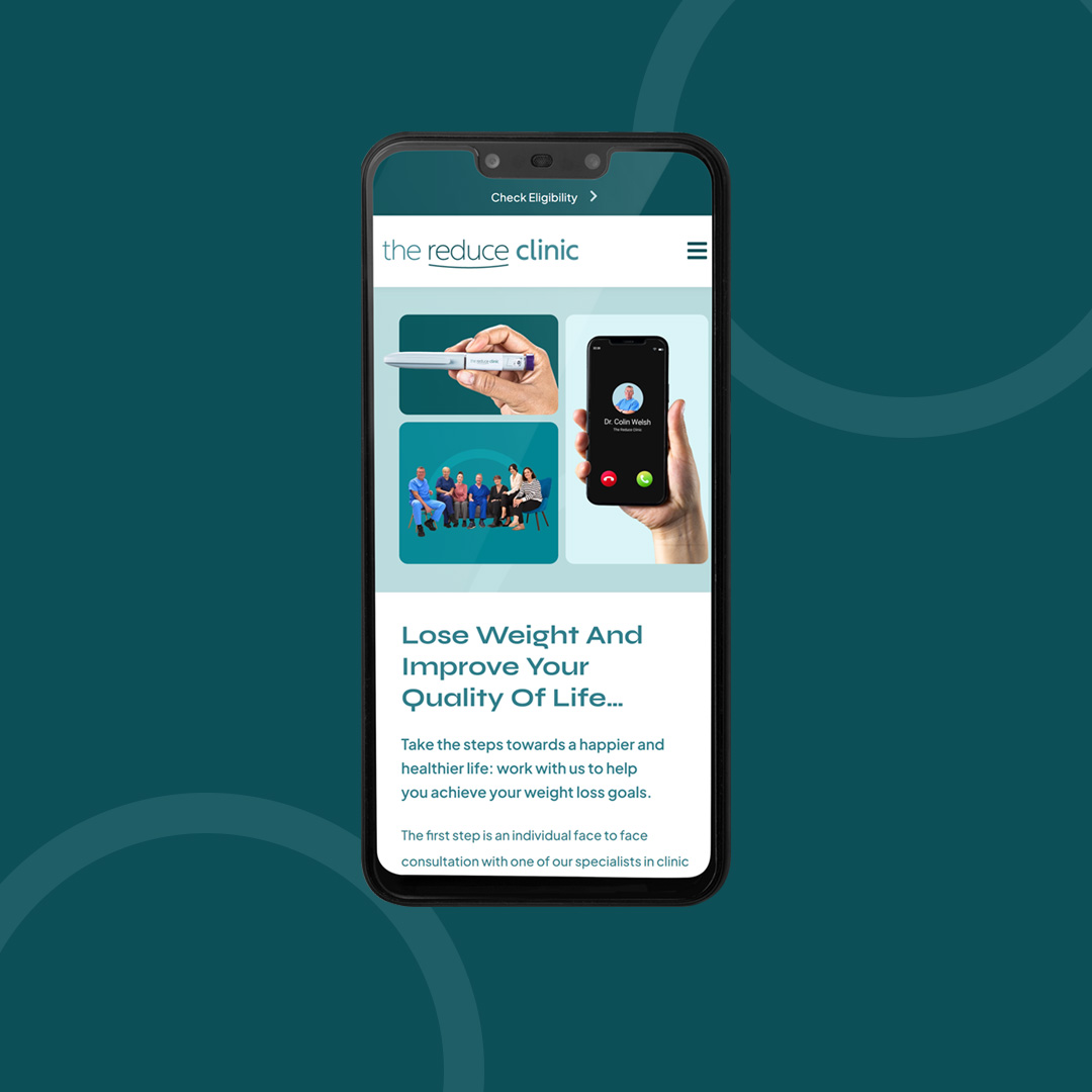
Once the brand guidelines were approved by the client, our team moved on to designing a brilliant website. With the support of copy written by the Content Team, we were able to clearly showcase the services offered along with a clear USP.
The site also required the integration of an online booking system and eligibility check to ensure access is for those who need it most, not anyone who just wants to drop a few pounds.
As ever the site was designed ‘mobile-first’ to ensure responsiveness across all devices and browsers, and the imagery and video content that we shot added to back up the fact this is a legitimate business run by real medical professionals.


